
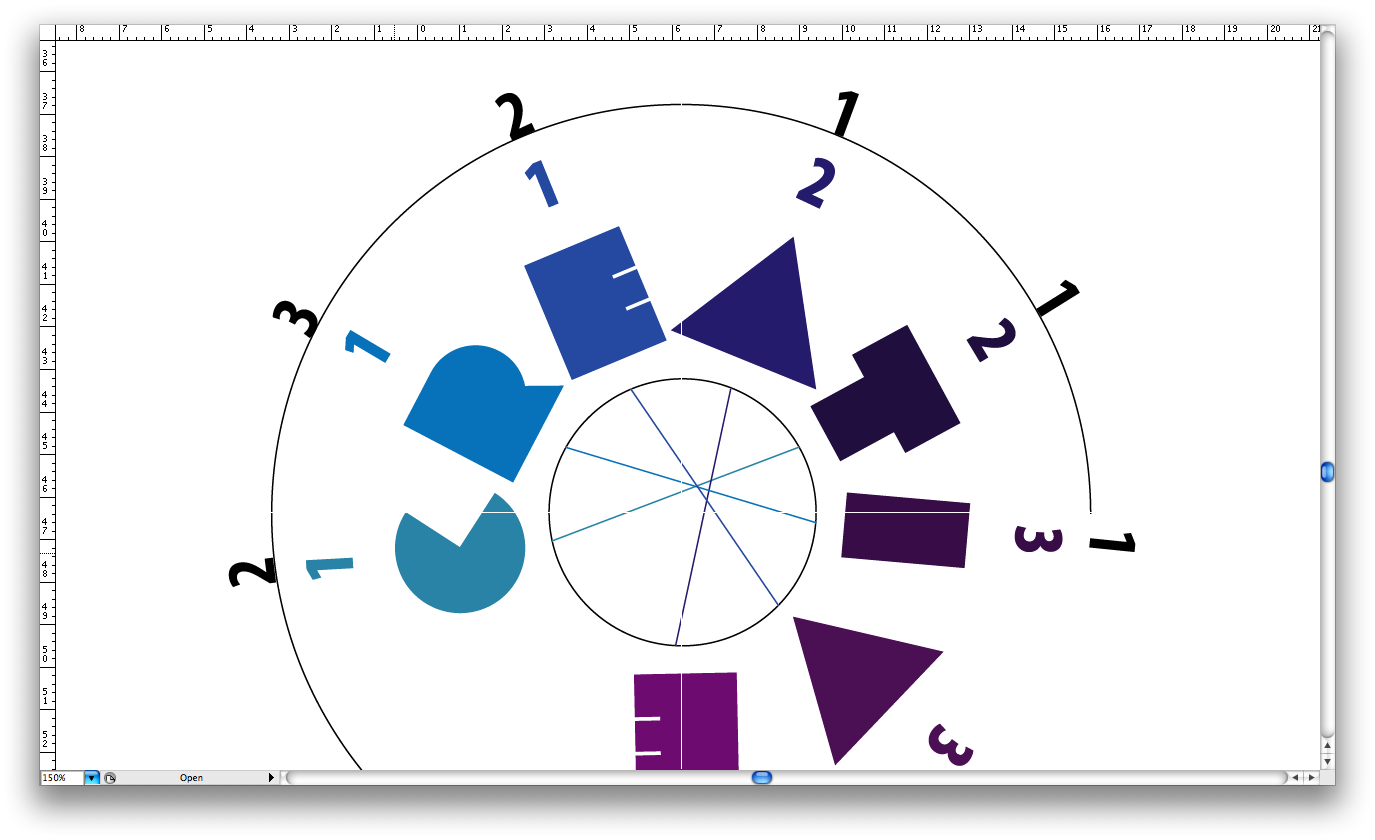
Below are a series of screen shots which show some of the initial development of the info graphic board. The screen shots show developments in format, type, layout and colour.
The fundamental issue of this piece, is how it communicates with the audience, and the language used for understanding. The type was again an important factor, to make this piece work with the seires of boards already produced by Peter. Peter used the font 'Myraid Pro' in the series of boards he produced, and it was obvious to use the same font to make the boards work as a series.
Once again the colour pallet was fundamental. The viewers main source of understanding is based on how the colour pallet draws their attention. Further to this, the layout will make the piece informative and clearer to the viewer.


No comments:
Post a Comment