Going back to the tutor quote spread - as a team we set each other the task to produce layouts for the tutor quotes using both double page and single page spreads. My DPS's are on a previous post, and this is some of my initial development using the SPS's.
Again, i much prefer using the single page spreads for the quote pages - this is for both aesthetics and costing for the client. Although there is less space on each page to play with, the positioning of the type including the body copy does not look out of place or crowded.
I found that using different coloured type for the info (contact details, name etc) and then using another colour for the main quote and body copy worked really well. I feel that one of these layouts will be put forward to the team as one of my best (so far.)

Monday, 28 February 2011
Yearbook - The Grid
Because all the team were using different grids for the initial stages of development. We all decided to have a meeting to sort out the grid system.
We opted for:
- 9 Column Grid
- 3mm Gutter
- 9mm Margins
This allowed each of us to adapt the grids we had been previously using (in my case - 3 column) I have found this grid easier to control though, is allows me to experiment further with the layout of both imagery and text - although i have been trying to split the 9 columns down to just 3 to keep the piece working with the concept 3 in mind.

Yearbook - Contents SPS's
Below is the issuu document which shows the development of the contents spread page. In our last group meeting we were asked to produce a SPS and a DPS for the contents pages, however i feel that the contents list should not be spread across a double page and just kept to a single page. Through the issuu document below you will see my development with the type face, colour pallet and use of the grid system.
Throughout the development, i found the small details in the design made all the difference, for example the spreads where i have changed the colour of the page numbers, to stand apart from the student names, quotes and visiting professional pages.
I also found that the layout of the Contents menu was essential, i have tried to keep an ongoing theme to all my spreads, which you can see i have kept to in these spreads. Although i found that having the 'Contents' vertical to the rest of the type works really well and would be a great opening page to the yearbook.
Saturday, 26 February 2011
Boost - Logo Development 6
Further logo development here - using a lighter colour pallet which is obvious, however here I have experimented with the 3d backdrop that I had included in the last Boost post. This time i feel the backdrop is a lot clearer, it allows the viewers focus to be maintained on the type apposed to the shape and scale of the backdrop.
I have also started adding 'it's a no brainer' which is Boost's strap line. I am nt 100% sure if i will use this in the final logo design, but I felt it was a good idea to experiment at this point rather than further down the line.
The logo is definatly heading in the rite direction, and I feel after a few changed with the format and layout of the design, I could well be there with it.

Monday, 21 February 2011
Boost - Logo Development 5
Experimenting with a 3D backdrop for the Boost logo. I wanted to add another detail to the logo to make it bolder, and unique. The hand rendered typeface is working well so far, but I feel it needs something to attract audiences attention, and to make the design stand apart from the other energy drink brands out there.
The design at this stage has the tone of voice I had in mind for my audience. I wanted the design to be clean, bold, fun and approachable - I feel I have achieved this so far, however more development is needed before the final resolution is produced.

The design at this stage has the tone of voice I had in mind for my audience. I wanted the design to be clean, bold, fun and approachable - I feel I have achieved this so far, however more development is needed before the final resolution is produced.

Saturday, 19 February 2011
Yearbook - Student DPS's
Much like the previous post which shows some of the development for the tutors DPS's - this Issuu document shows the development of the student DPS layouts.
Once again i was experimenting with the layout, type, colour pallet, readability and legibility of the document. I do not feel i have explored this part of the yearbook to its full potential, however other team members have covered this area in full and with great success.
I decided to keep to the 3 column grid, apposed to using more columns to allow more composed layout designs.
I'm pleased with how these layouts have turned out, some more so than other. I do not feel the pages which use 2 separate background colours work as well. I feel the solid backgrounds work better alongside the images, titles and body copy.
Friday, 18 February 2011
Yearbook - Tutors DPS's
A series of experimental DPS (Double Page Spreads) to show development in terms of colour pallet, type and layout. The tutors spreads will include their role to the course, contact details and a quote about the year group.
For the sake of experimentation, i took the Fred's quote from the 1st yearbook to be produced on this course. I felt this would be the best way to see how many words would be in the quote and how i could use the given format to layout all the details above.
At this point we are looking at the typeface and point sizes in particular. Each of the design team is producing their own formats and layouts for Tuesday 22nd - where we will be having a meeting to discuss stronger concepts and decide on a direction the layouts will be going in.
Wednesday, 16 February 2011
Boost - Coca Cola Developments
Well, here is a concept for a new coca cola bottle. And i think its brilliant! As a part of the boost brief - they said that packaging can be re-designed. Now this wasn't an area that interested me, however seeing this concept from coke, i feel i would be happy to give it a go, retro could be back in in terms of packaging design etc.


Tuesday, 15 February 2011
Boost - Logo Development 4
After getting so far with the logo, I decided I would have a quick experiment with the colour pallet. At this point I want each letterform to be legiable, so i decided to place a gradiant on each to break it up. I like the concept behind these, but I do not feel confident that these colours alone could represent a energy drinks company.
I also feel that the logo i have experimented with here is not the strongest of the ones I have produced so far, and that they could all do with some other detail(s) to represent the brand better.

I also feel that the logo i have experimented with here is not the strongest of the ones I have produced so far, and that they could all do with some other detail(s) to represent the brand better.

Yearbook Pitch
Below is the pdf of our final 3 board submission for the yearbook brief. We tried to make the concept as simple, direct and relavent to the course as possible. The first board immediately informs the viewer of the concept and relevence of this, to the courses yearbook.
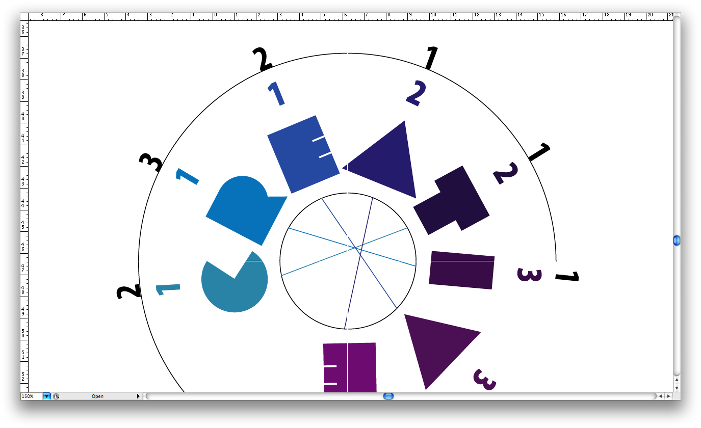
With our concept being '3' it seemed almost natural to make the first board all about this concept, and how it can be put across all aspects of the design.
Board 3 - Allows the viewer to gain a better understanding of the typeface, colour pallet, stock choices and the media in which we will promote and advertise both the course and the exhibiton.
With our concept being '3' it seemed almost natural to make the first board all about this concept, and how it can be put across all aspects of the design.
- 3 Colour Palette
- 3 Images (per student)
- 3 Pieces of Work
- 3 Column Grid
- 3 Weights of Typeface
- 3 Studio Spaces
Board 3 - Allows the viewer to gain a better understanding of the typeface, colour pallet, stock choices and the media in which we will promote and advertise both the course and the exhibiton.
Wednesday, 9 February 2011
Boost - Logo Development 3
Because of the current identity being positioned vertically, i decided it would be good to experiment with this layout. Below i have experimented with each of the logos and the position of the word 'Energy'.
Some of the logos look really good, however some other designs have issues with the legiability and readability because of this positon. Like the other designs, i have not pushed them in terms of colour pallet, at this stage of the design process i purely want to get a feel for the design itself apposed to being distracted away because of a pretty finish.


Some of the logos look really good, however some other designs have issues with the legiability and readability because of this positon. Like the other designs, i have not pushed them in terms of colour pallet, at this stage of the design process i purely want to get a feel for the design itself apposed to being distracted away because of a pretty finish.


Boost - Logo Development 2
As i said in the previous post - i liked the direction one of my initial concepts was going in. So i decided to quickly produce this identity digitaly.
I have played around with the layout of the type, and how it reads. I feel some of the resolutions below are more succesful than others.
I feel again that this concept is pretty strong, and looking at the existing identity, which is positioned horizontly on the cans and bottles etc - this maybe a direction i consider.
The next steps are to go back to the drawing sheets and produce more logo concepts. From this point i will develop the stronger resolutions in a digital form like the ones below. From that point i will be considering colour pallet and further artwork to be placed on some of the products.


Boost - Type Selection
To get the logo design started, I decided to go through my Font Book to find typefaces that I felt represented Boost in terms of audience and tone of voice. The current logo is bold - yet flat and motionless. Because the brief allows me to choose my own audience, I feel it should become more friendly and fun, apposed to boring and bold.
Another part of the design I need to consider is the colour pallet. I feel the current logo and colour pallet are to heavey, aggresive and probably costly to print. When designing a new logo, i will be considering this, and how i can cut the cost in the production process.

Another part of the design I need to consider is the colour pallet. I feel the current logo and colour pallet are to heavey, aggresive and probably costly to print. When designing a new logo, i will be considering this, and how i can cut the cost in the production process.

Tuesday, 8 February 2011
Boost - Logo Development 1
Here is the first series of hand-rendered type for the re-brand of the energy drink Boost. The brief stated that I could choose the direction i decided to take the re-brand, choosing what I felt was the best audience to direct the products and the brand.
I decided I wanted this product to be directed towards both sex's, and that has allowed me to be playful with the type, trying to create a fun, laid back identity in answer to the brief.
These images below show my initial development with the identity. Because i like the direction which one of these designs has taken, i will take it forward into illustrator to create a digital version - which could be further developed itself.


Monday, 7 February 2011
Yearbook (Final Cover Spread)
Below is the final cover spread which will be pitched to the tutors along with the rest of the concepts which the rest of the team have been working on. The spread has come out well, it is clear, communicates all the information effectively and in a simple form.
The black spine has been included, along with the white 'stock' background and the orange which will also be used to gain viewers attention and will be immediatley recognised by designers and further audiences.

The black spine has been included, along with the white 'stock' background and the orange which will also be used to gain viewers attention and will be immediatley recognised by designers and further audiences.

Sunday, 6 February 2011
Yearbook (Initial Cover Concepts) 3
Finally we have a clear direction for the cover which will be shown in the pitch. We are working with one typeface but using 3 weights to communicate effectively. We opted for using a standard white background, allowing the orange to come through and grab the viewers attention.
As mentioned in the previous blog post, it is important to communicate the year group, the course and the university (college).
I have brought through the black spine, although this can still be changed, but probably wont be seen in the pitch board.
Time to finalise one design, and put it forward.

As mentioned in the previous blog post, it is important to communicate the year group, the course and the university (college).
I have brought through the black spine, although this can still be changed, but probably wont be seen in the pitch board.
Time to finalise one design, and put it forward.

Boost - The Competitors
Looking at the competitors for Boost on the market at the present time - you can see that most of the logos are bold, with outrageous colour pallets, strong fonts with use of illustrations.
At this stage it seems essential for the typeface to be clear and consise, put across the message and become instantly recognisable too the audience.


At this stage it seems essential for the typeface to be clear and consise, put across the message and become instantly recognisable too the audience.


Creative Time Bank (Final Boards)
So these are the final series of design boards that we will be handing in to either Michael and / or Garry. Me and Boysie feel that our boards explain our concept in a good order and answers relevant questions a viewer may have.
The first board show the final resolution for the re-brand and how the identity can be adapted and spread, so that it works across different cities in the UK.
The second board goes on to talk about the colour pallets which would be used across the different cities (we gave 3 examples: Leeds, Manchester and Nottingham) This board also informs the viewer about a concept which involves an iphone app which could be used to record the exchange of time between professionals.
The third board briefly explains the credit system we have developed. When we attended the briefing, it became clear to myself and Boysie that the client was not a designer, and had no real direction in which he wanted this brief to be taken. It was a very vague and brief discussion on what he wanted produced. However myself and Boysie redesigned the system which was currently in place (with around 20 users) so that it was clearer to understand, easier to follow and sign on to. Our credit system was designed and focused around the digital side of the industry, however we designed a set of credits (which spelt creative) that would be issued out to new members of the time bank. These physical credits could be used however each individual member wanted, because our system was directed at registering time via a network, which would work in simular ways to facebook (being a networking system)
The forth board is simply there to instruct our client on how the physical credit system works, and how accesable this is to new members, and how it could be used around the country with a mix of credits which originate from certain locations (cities)


Saturday, 5 February 2011
Yearbook (Initial Cover Concepts) 2
After a talk with the team and some research into publication which are based around numbers, i went back to the design board and started producing the pieces below.
We wanted the '3' to be the main focus of the yearbook, and for the other details to be legiable but not to take the attention and main focus of the viewer.
The covers below are all experimenting with colour, format and type. From these designs, at this point it became obvious to the team that using black was a bad idea, both for costing and for legiability and bleed of the ink once printed. The spine is the only area we could think of using the black, this way it does not draw away attention, however on a book shelf it would stand out with the orange type.
Details which must be on the covers include:
- Year Group
- Course
- University


Yearbook (Initial Cover Concepts) 1
While we all broke off to do seperate tasks on the year book, i was left to produce a design for the front cover which would be used in our initial pitch. My initial ideas were very basic, obviously keeping to the theme of '3' i originally explored the idea of using image to communicate 3 to the audience.
The designs below are very simple, they all explore the use of type, format and legiability. WE had already decided what our colour pallet would be. We wanted it to work along with the previous 2 yearbooks to be produced from this course. (Yellow and Red) Orange seemed the best direction to take it.
However after some research with my team members, we found some designs which influenced our direction away from where we started.


Friday, 4 February 2011
Creative Time Bank
Below, are a series of info graphic boards designed to communicate with the audience, how the currency system works. Both myself and Boysie were confident in the direction we took the brief in, however we felt an info graphic to explain the currency system was appropriate.
These are the info graphics as developed so far, however there are developments planned, which maybe pitched to show how this system works on a greater scale.
Through the series of boards, it shows experimentation in terms of the layout of the information. The designs were produced with minimal but informative information in mind, as well as a limited colour pallet which allows the attention to be drawn to the graphic.


Thursday, 3 February 2011
Creative Time Bank (Development)
Below are a series of screen shots which show some of the initial development of the info graphic board. The screen shots show developments in format, type, layout and colour.
The fundamental issue of this piece, is how it communicates with the audience, and the language used for understanding. The type was again an important factor, to make this piece work with the seires of boards already produced by Peter. Peter used the font 'Myraid Pro' in the series of boards he produced, and it was obvious to use the same font to make the boards work as a series.
Once again the colour pallet was fundamental. The viewers main source of understanding is based on how the colour pallet draws their attention. Further to this, the layout will make the piece informative and clearer to the viewer.


Subscribe to:
Comments (Atom)