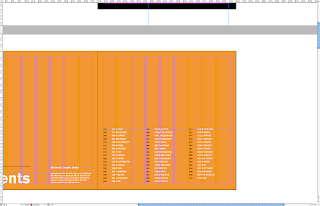
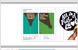
As mentioned in a previous post, i talked about how we changed the grid system from a 3 column to a 9 column grid with set margins and gutters. Below are a couple of images which show how I have been using the columns while keeping to the concept of 3.
Each text box is spread over 3 columns, which allows for 3 wide in total - again keeping to the concept of 3. The contents page below is the perfect example to show how this can be used in a clear and legible form.
An issue which has been discussed in each of our meetings in the formation and layout of imagery. It is essential that the layout works for each student, from a typographer to an illustrator.
Considerations:
- Full bleed imagery
- Cropped images (at the designers discretion)
- Background colour - does it compliment or drown the design?


No comments:
Post a Comment