Here are the final boards for my Boost Re-Brand. The boards show the development from the logo across the range covered.

Showing posts with label Boost Re-Brand. Show all posts
Showing posts with label Boost Re-Brand. Show all posts
Thursday, 2 June 2011

Tuesday, 19 April 2011
Boost - Can Mock-Ups
It's nice to finally see a design printed and mocked-up (as best i could). But what these images show me is how the design is working. I have kept to the rule of the Golden 3rd and kept the logo as the fundamental view point of the can, and allowed the artwork to take a back seat, however still filling the space, with a good concept.
The colours have come out well, although I feel the blue used on the Sugar Free can, needs to be the same pantone colour as the Energy drink.
The next stage of this process is to get the design printed onto flat aluminium, which will show me if the colour work or not. It will also get rid of the white sections in the artwork, which will be replaced with the silver of the aluminium (making it cheaper to print)


The colours have come out well, although I feel the blue used on the Sugar Free can, needs to be the same pantone colour as the Energy drink.
The next stage of this process is to get the design printed onto flat aluminium, which will show me if the colour work or not. It will also get rid of the white sections in the artwork, which will be replaced with the silver of the aluminium (making it cheaper to print)


Friday, 15 April 2011
Boost - Final Can Artworks
Finished and ready to be printed for the mock-ups - 3 of the artworks for the cans, which seperate the range through the use of colour and a type detail.
The labels below are for:
1 - Boost Energy
2 - Boost Sugar Free
3 - Boost Cola
After establishing a concept, it was a fairly simple process to produce an artwork to work. Using small details for electronic pictograms and the use of colour, it was easy to split the range apart to work on their own or together.
Next step - Trying these prints on a mock-up can.

The labels below are for:
1 - Boost Energy
2 - Boost Sugar Free
3 - Boost Cola
After establishing a concept, it was a fairly simple process to produce an artwork to work. Using small details for electronic pictograms and the use of colour, it was easy to split the range apart to work on their own or together.
Next step - Trying these prints on a mock-up can.

Wednesday, 13 April 2011
Boost - Label Development 2
Because I now have a considered concept behind my can artwork - I decided this is an appropriate time to get the layout of the logo and type in order (the type being the ingrediants, recycling details, nutrition values etc)
The colours selected below will also be used in the final designs. I looked at the existing artworks for the Boost cans and found that the seperation between each product is obvious through a small detail in the colour. The first and third examples below will be the standard Energy drink, and the Silver (white) label will be for the sugar free drink.
The design at the bottom shows the correct placement of the logo and type (at this point) as this allows the space for the artwork and legiability.

The colours selected below will also be used in the final designs. I looked at the existing artworks for the Boost cans and found that the seperation between each product is obvious through a small detail in the colour. The first and third examples below will be the standard Energy drink, and the Silver (white) label will be for the sugar free drink.
The design at the bottom shows the correct placement of the logo and type (at this point) as this allows the space for the artwork and legiability.

Sunday, 10 April 2011
Boost - Label Concept
The artwork to go on can designs is a very important issue. After picking my brain for a while I was finally able to come up with a concept which covered the products name (Boost) and what it does (Gives Energy).
I decided to look back into my old school electronic work, where switches, diodes and circuits all produced some sort of energy. The image below along with my key explains it better:
Putting it simply, the Supply is the Boost drink and through the process of opening the can, the customer recieves the energy (load).

Below: Some development of the artwork, which will include small details from electronic pictograms.


I decided to look back into my old school electronic work, where switches, diodes and circuits all produced some sort of energy. The image below along with my key explains it better:
- Supply = Boost (Drink)
- Switch = (Ring Pull)
- Diode = Direction
- Load = Customer
Putting it simply, the Supply is the Boost drink and through the process of opening the can, the customer recieves the energy (load).

Below: Some development of the artwork, which will include small details from electronic pictograms.


Tuesday, 5 April 2011
Boost - Label Development 1
Starting the label artwork is a big task. After some great advice from Lorenzo where I was told to consider the Golden 3rd, which is the section of the cans artwork that is most important to the potential customer, I have started to produce a basic layout to work too. This will allow me to consider colour, type choice, and layout. What I really need at this point is a concept for the artwork - it's all good drawing a pretty picture, but I feel a rebrand like this needs a strong concept for the artwork to go alongside the new identity.


Monday, 14 March 2011
Boost - Experimenting with the Logo
The tutorial with Lorenzo was extremely helpful. I went prepared with several questions concering each brief. For the Boost re-brand, i needed to know how to test my logos, and his answer was simple, print the logo, while experimenting with the colour pallet, stick it on the can (using the Golden Third rule) and photograph it to see how it comes out.
Below i have taken one of my developed identities and experimented with limited colour pallets for each.
At this stage, im pretty pleased with the identity - i feel it works well on the can, and is different from all its current rivals products and logos. Although these design use minimal colour, i am still getting a better impression for how the design is developing.

Below i have taken one of my developed identities and experimented with limited colour pallets for each.
At this stage, im pretty pleased with the identity - i feel it works well on the can, and is different from all its current rivals products and logos. Although these design use minimal colour, i am still getting a better impression for how the design is developing.

Sunday, 13 March 2011
Boost - Final Logo
After all the experimentation with colour etc so far, I have decided this is the best logo I have developed, and this is the design I will be using in the developing stages of this brief.
Its clean, bold, fun and unique. The typeface is hand rendered and the 3d backdrop adds impact to the design. These are the details which can be changed in terms of colour pallet and scale.

Its clean, bold, fun and unique. The typeface is hand rendered and the 3d backdrop adds impact to the design. These are the details which can be changed in terms of colour pallet and scale.

Thursday, 10 March 2011
Boost - The Third Rule
After a tutorial yesterday with Lorenzo, he told me about the golden third of a can. He told me this is where the fundamental part of the design must be, as thats how the can is stacked on the shelf, with the logo facing outwards. I had a general idea that the logo had to be placed in a certain section, but it seems its essential the majorty if not all of the logo must be kept inside the 1st third.
The image below of the current Boost can, show a simple layout showing how the golden third would appear on the shelf. Interestingly, the current Boost logo sits off from this golden area, and because of this it is not legiable to potential customers rite away - a mistake i will not make.

The image below of the current Boost can, show a simple layout showing how the golden third would appear on the shelf. Interestingly, the current Boost logo sits off from this golden area, and because of this it is not legiable to potential customers rite away - a mistake i will not make.

Wednesday, 9 March 2011
Boost - Logo Development
This post is to show how the development of the Boost re-brand is coming along. Because the brief allows the designer to choose their tone of voice and target audience - my design has taken form to target 16+ Year olds, both males and females. Although i have already looked into the existing colour pallets and bottle / can artwork that Boost currently uses for their range, i do not feel i am at the point to start the range artwork. The logo is in its final stages and now i feel once this has been completed, the colour pallet can be seen too.

Boost - Current Flavours and Logos
With the logo developing well, i decided it was time to go onto the Boost website to look at current range of flavours and bottles/cans which were being distributed.
I was immediatley struck by the range of their products, being honest i thought they had 2 flavours of beverage to their name. Although this did shock it, it also made me feel more confident in the direction i should take the logo, to work across the range of products.
Boost Sport - The design includes photographed fruit, the standard logo horizontally placed apposed to vertical like some of the other products.

Boost energy (+Cola) - In this range, there are cans, medium and large bottles. There are two flavours, original and cola. The logo is placed vertically with minimal design in terms of colour pallet or imagery.

Boost Active - Much like the Active range, 2 bottle, 2 flavours, logo placed horizontally and a little bit more effort in terms of design, but still not good enough to stand out amongst its rivals.
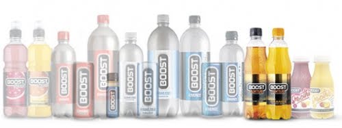
Boost Smoothie - My favorite of the range, small and well designed. Again the logo is placed horizontally and the imagery is very professional and gives the audience the immediate message of a smoothie.

All in all, i feel Boost is letting itself down in terms of being professional, and standing out from the rest of its rival products like Red Bull and Monster.
Saturday, 5 March 2011
Boost - Logo Development 7
After finally sorting out the direction of the logo, I have decided to look into colour and the use of the gradiant tool. The examples show selected colours which represent the logo itself well. However I feel i need to look back at the current range of Boost products to get a better understanding and direction for the colour pallet and extra details to be included on each design. For example:

- Boost Energy
- Boost Sugar Free
- Boost Cola
- Boost Sport (2 Flavours)
- Boost Smoothie

Saturday, 26 February 2011
Boost - Logo Development 6
Further logo development here - using a lighter colour pallet which is obvious, however here I have experimented with the 3d backdrop that I had included in the last Boost post. This time i feel the backdrop is a lot clearer, it allows the viewers focus to be maintained on the type apposed to the shape and scale of the backdrop.
I have also started adding 'it's a no brainer' which is Boost's strap line. I am nt 100% sure if i will use this in the final logo design, but I felt it was a good idea to experiment at this point rather than further down the line.
The logo is definatly heading in the rite direction, and I feel after a few changed with the format and layout of the design, I could well be there with it.

I have also started adding 'it's a no brainer' which is Boost's strap line. I am nt 100% sure if i will use this in the final logo design, but I felt it was a good idea to experiment at this point rather than further down the line.
The logo is definatly heading in the rite direction, and I feel after a few changed with the format and layout of the design, I could well be there with it.

Monday, 21 February 2011
Boost - Logo Development 5
Experimenting with a 3D backdrop for the Boost logo. I wanted to add another detail to the logo to make it bolder, and unique. The hand rendered typeface is working well so far, but I feel it needs something to attract audiences attention, and to make the design stand apart from the other energy drink brands out there.
The design at this stage has the tone of voice I had in mind for my audience. I wanted the design to be clean, bold, fun and approachable - I feel I have achieved this so far, however more development is needed before the final resolution is produced.

The design at this stage has the tone of voice I had in mind for my audience. I wanted the design to be clean, bold, fun and approachable - I feel I have achieved this so far, however more development is needed before the final resolution is produced.

Wednesday, 16 February 2011
Boost - Coca Cola Developments
Well, here is a concept for a new coca cola bottle. And i think its brilliant! As a part of the boost brief - they said that packaging can be re-designed. Now this wasn't an area that interested me, however seeing this concept from coke, i feel i would be happy to give it a go, retro could be back in in terms of packaging design etc.


Tuesday, 15 February 2011
Boost - Logo Development 4
After getting so far with the logo, I decided I would have a quick experiment with the colour pallet. At this point I want each letterform to be legiable, so i decided to place a gradiant on each to break it up. I like the concept behind these, but I do not feel confident that these colours alone could represent a energy drinks company.
I also feel that the logo i have experimented with here is not the strongest of the ones I have produced so far, and that they could all do with some other detail(s) to represent the brand better.

I also feel that the logo i have experimented with here is not the strongest of the ones I have produced so far, and that they could all do with some other detail(s) to represent the brand better.

Wednesday, 9 February 2011
Boost - Logo Development 3
Because of the current identity being positioned vertically, i decided it would be good to experiment with this layout. Below i have experimented with each of the logos and the position of the word 'Energy'.
Some of the logos look really good, however some other designs have issues with the legiability and readability because of this positon. Like the other designs, i have not pushed them in terms of colour pallet, at this stage of the design process i purely want to get a feel for the design itself apposed to being distracted away because of a pretty finish.


Some of the logos look really good, however some other designs have issues with the legiability and readability because of this positon. Like the other designs, i have not pushed them in terms of colour pallet, at this stage of the design process i purely want to get a feel for the design itself apposed to being distracted away because of a pretty finish.


Boost - Logo Development 2
As i said in the previous post - i liked the direction one of my initial concepts was going in. So i decided to quickly produce this identity digitaly.
I have played around with the layout of the type, and how it reads. I feel some of the resolutions below are more succesful than others.
I feel again that this concept is pretty strong, and looking at the existing identity, which is positioned horizontly on the cans and bottles etc - this maybe a direction i consider.
The next steps are to go back to the drawing sheets and produce more logo concepts. From this point i will develop the stronger resolutions in a digital form like the ones below. From that point i will be considering colour pallet and further artwork to be placed on some of the products.


I have played around with the layout of the type, and how it reads. I feel some of the resolutions below are more succesful than others.
I feel again that this concept is pretty strong, and looking at the existing identity, which is positioned horizontly on the cans and bottles etc - this maybe a direction i consider.
The next steps are to go back to the drawing sheets and produce more logo concepts. From this point i will develop the stronger resolutions in a digital form like the ones below. From that point i will be considering colour pallet and further artwork to be placed on some of the products.



Boost - Type Selection
To get the logo design started, I decided to go through my Font Book to find typefaces that I felt represented Boost in terms of audience and tone of voice. The current logo is bold - yet flat and motionless. Because the brief allows me to choose my own audience, I feel it should become more friendly and fun, apposed to boring and bold.
Another part of the design I need to consider is the colour pallet. I feel the current logo and colour pallet are to heavey, aggresive and probably costly to print. When designing a new logo, i will be considering this, and how i can cut the cost in the production process.

Another part of the design I need to consider is the colour pallet. I feel the current logo and colour pallet are to heavey, aggresive and probably costly to print. When designing a new logo, i will be considering this, and how i can cut the cost in the production process.

Tuesday, 8 February 2011
Boost - Logo Development 1
Here is the first series of hand-rendered type for the re-brand of the energy drink Boost. The brief stated that I could choose the direction i decided to take the re-brand, choosing what I felt was the best audience to direct the products and the brand.
I decided I wanted this product to be directed towards both sex's, and that has allowed me to be playful with the type, trying to create a fun, laid back identity in answer to the brief.
These images below show my initial development with the identity. Because i like the direction which one of these designs has taken, i will take it forward into illustrator to create a digital version - which could be further developed itself.


I decided I wanted this product to be directed towards both sex's, and that has allowed me to be playful with the type, trying to create a fun, laid back identity in answer to the brief.
These images below show my initial development with the identity. Because i like the direction which one of these designs has taken, i will take it forward into illustrator to create a digital version - which could be further developed itself.


Subscribe to:
Posts (Atom)