
Showing posts with label Shammix. Show all posts
Showing posts with label Shammix. Show all posts
Thursday, 2 June 2011
Shammix (Final Boards)
Final boards for my Shammix brief. After a lot of messing around and mislead clint feedback, finally a logo resolution was finalised and a small but significant range was produced. This was not the most enjoyable brief, however it was useful to collaborate with Jonny Packham, who produced the illustrations for album artwork and tickets.

Saturday, 9 April 2011
Shammix - Flyers and Posters 2
For the 2nd part of the Summer rave featuring Shammix, I went for a different layout and once again using a lighter colour pallet. The colour pallet is also in theme with the venue (The Outback) which is an australian sports bar - and this flyer using spot colours from their own logo, to help the audience understand where the venue is.
Next job is to get these printed and see how the type is working in terms of legiability and readability. Job after that, pricing up 'x' Number of copies (according to my clients needs)


Next job is to get these printed and see how the type is working in terms of legiability and readability. Job after that, pricing up 'x' Number of copies (according to my clients needs)


Thursday, 7 April 2011
Shammix - Flyers and Posters
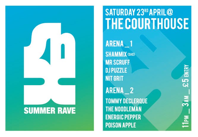
After experimenting with the type and layout of both the posters and the flyers, I finally found a good way for the posters and flyers to be read. I decided to promote Shammix from the start, making the logo the header and most important aspect of the evening.
I went with a bold typeface to keep viewers attention and for legiability at a smaller scale. So far im pleased with how these designs have come out, although I do not feel that they represent a 'Summer Rave' in terms of the colour pallet. I want to keep the colour minimal, for printing costs - plus I felt that black was to dark and heavey for the theme.


Below I have used a gradiant of blue and green. This is much more summary, and runs well with the theme of a summer rave. I also feel the colour pallet is more eye-catching and unique than a standard black and white flyer and poster.


I went with a bold typeface to keep viewers attention and for legiability at a smaller scale. So far im pleased with how these designs have come out, although I do not feel that they represent a 'Summer Rave' in terms of the colour pallet. I want to keep the colour minimal, for printing costs - plus I felt that black was to dark and heavey for the theme.


Below I have used a gradiant of blue and green. This is much more summary, and runs well with the theme of a summer rave. I also feel the colour pallet is more eye-catching and unique than a standard black and white flyer and poster.

Wednesday, 6 April 2011
Shammix - Promo Development
After finally finishing the full and abbreviated Shammix logos, it was time to start the promotion process. Shammix will be performing 3 - 5 sets over the summer period, titled the 'Summer Rave' I have decided I will break each performance into a Part.
This allows me to produce flyers and posters with a different colour pallet and layout for each to stop confusion of the same venue, dates etc.
Below are some quick experiments to see how i could fit the abbreviated and full logo onto an A6 flyer. The format is small, and both of the logos are hard to fit to it, but its best to discover these problems now before its too late.

This allows me to produce flyers and posters with a different colour pallet and layout for each to stop confusion of the same venue, dates etc.
Below are some quick experiments to see how i could fit the abbreviated and full logo onto an A6 flyer. The format is small, and both of the logos are hard to fit to it, but its best to discover these problems now before its too late.

Monday, 4 April 2011
Shammix (Final Logo?)
Shammix logo at its final point. The client wanted the all the letterforms joined, which i was happy to do, however when i joined the 'm' and 'i' it became illegiable, and made the whole design feel cheaper. The version below has all the letterforms joined up, the 'a' into the 'h' looks really nice, with a slight stroke on the outside to break it up.
Im pleased with how these have come out, i feel it has taken me too long to get to this point however, due to other brief commitments. Now comes the fun part of putting the logo across the range. Including venue tickets, flyers, posters, album artwork, limited edition vinyls etc.

Im pleased with how these have come out, i feel it has taken me too long to get to this point however, due to other brief commitments. Now comes the fun part of putting the logo across the range. Including venue tickets, flyers, posters, album artwork, limited edition vinyls etc.

Monday, 7 March 2011
Shammix (Logo Development 6)
As mentioned on the previous post, i wanted to produce an abbreviated version of the Shammix logo. The first 3 examples below are the abbreviated identities - which im very pleased with. I like to play around with type, and because this is a shorter, more direct identity, i feel it can be playful, intriguing and inviting.
I like all 3 of these designs, however i would prefer to develop the 1st and 3rd design. I feel these two designs have more too them, and with some colour added could be very vibrant, and even work with imagery.


The 3 resolutions above were developed from the abbreviated identities i produced at the top of this post. These designs are harder to understand than the originals, and have issues with legibility and readability. I do feel however, that they are aesthetically pleasing, and that the 1st and 3rd designs once again work best and could be developed further, depending on my clients feedback.
Shammix (Logo Development 5)
The Shammix logo has taken further development since the last blog post. After visiting my clients sound cloud page, i saw how he has typed out 'Shammix' and felt i should try and develop the indentity in the same way. 'Shammix' was typed out 'ShAmMiX' so i felt playing with the upper and lowercase, point size and stroke of the typeface would come out with a solid resolution and a clearer design direction.
You can see below how in each of the resolutions i have experimented with the form of the design. Experimenting with the kerning between each letterform and the point size was also experimented with. Some of the resolutions are better than others, however i feel the 2nd, 3rd and 5th resolutions work the best.
Whats next? An abbreviated version of the Shammix identity.

Shammix (Logo Development 4)
After emailing my client last thursday, it was made clearer to me the direction which they wanted me to take their logo in. The client (Shane) commented on a previous blog, saying how he liked how the two 'm's in the name were joined.
Shane also wanted the identity to be in a more stylised typeface, one which would be instantly recognisable and memorable to Shammix - this meant steering clear of both Arial and Helvetica.
The designs below have been developed from this point forward. There are a couple of strong concepts coming along at the minute, but these resolutions still need further development.


Saturday, 5 March 2011
Shammix - Logo Feedback + Development
After emailing my client and asking for some feedback on the development made so far - he replied swiftly and mentioned the design below.
He commented on how the 'mm' in shammix was joined, and that this is the direction in which he wanted the identity to go in. He went on to ask for the identity to be based on the same concept but a more stylised font, with some colour.
Because of the amount of yearbook work at the minute, i decided to spend today trying to complete the shammix logo ready for next weeks crits.

Friday, 28 January 2011


Shammix (Logo Development 3)
Development for the Shammix logo has further developed below. One of the fonts which i decided to start experimenting with was a strong contendor for the finalised logo. However some of the letterforms were not legiable or looked simular to other letters.
I had some real trouble with the 'x' for both the abbreviated and full identity. At this point it was rite to try and produce the letterform again, making it clearer to the audience. At the same time i played around with the form of both the 's' and the 'h' for the abbreviated identity. Below are the final series of resolutions which show the development clearly. The first example is the letterforms in their standard form (minus the black square above the 'h').

I had some real trouble with the 'x' for both the abbreviated and full identity. At this point it was rite to try and produce the letterform again, making it clearer to the audience. At the same time i played around with the form of both the 's' and the 'h' for the abbreviated identity. Below are the final series of resolutions which show the development clearly. The first example is the letterforms in their standard form (minus the black square above the 'h').

Misc Logos 2
More identities which i have researched below. All these examples are type based and are focused on the layout and format of the piece. I feel these examples reflect the design direction my client wishes for me to take. The fonts used for these logo and beautifully rendered and the majority (except 1) are legiable and readable, which again, is a big issue to both myself and my client.
This part of my research has helped me in the direction to take the identity, and also helped me identify ways in which i can display my logo designs on a website. Watch this space.


This part of my research has helped me in the direction to take the identity, and also helped me identify ways in which i can display my logo designs on a website. Watch this space.


Misc Logos
As a part of the Shammix brief, my client wants a smaller illustrated logo. My client did his research into existing pieces like the Deadmau5 illustration. This part of the brief is a big vague though, and i feel that i may leave this part of the brief until after i email him later today with 3 developed logos. This will give me a basis in terms of weight, stroke and composition i have to work with, with the chosen logo.
The examples below are some of my favorites. They are simple, yet affective and carry humour which is brilliant for the viewer.
From this point i will also be looking at the colour pallet, unless my client has already made his mind up. The next few days will be very experimental in terms of my design direction, hoever i feel confident with the progress made so far.


The examples below are some of my favorites. They are simple, yet affective and carry humour which is brilliant for the viewer.
From this point i will also be looking at the colour pallet, unless my client has already made his mind up. The next few days will be very experimental in terms of my design direction, hoever i feel confident with the progress made so far.


Tempa.
Through my research i found this re-brand and product development. Tempa. is a dubstep and garage record label run by Ammunition Promotions. The label was established in 2000 and saw a re-brand in 2006. I took these examples as this is what i feel my client is after, he wants an identity which is solid, heavy and bold.
Although the example below is a re-brand for a record label not an artist, the same design principles apply. The genre of music Tempa. caters for is simular to that of Shammix. Looking at these high end print vinyls and how the logo can be adjusted to work with the print techniques i feel confident in the direction i wish to take this brief.
However i feel before i rattle my design down to a final 2 or 3, i need to do more research to look into existing identities for artists and labels alike.


Although the example below is a re-brand for a record label not an artist, the same design principles apply. The genre of music Tempa. caters for is simular to that of Shammix. Looking at these high end print vinyls and how the logo can be adjusted to work with the print techniques i feel confident in the direction i wish to take this brief.
However i feel before i rattle my design down to a final 2 or 3, i need to do more research to look into existing identities for artists and labels alike.


Thursday, 27 January 2011
Shammix (Logo Development 2)
Further development with the Shammix identity. Here i have decided to go in the direction of legiability and readability. I have purely taken some time to experiment with the form, point size and kerning of the type.
Some of the resolutions are more succesful than others. There are a few points which i can take forward from each design, to help create a stronger, more eye-catching and memorable identity than the ones below.
I feel that once i start designing an abbreviated version of the Shammix logo reading SHX - then the identity will come together a lot quicker.


Some of the resolutions are more succesful than others. There are a few points which i can take forward from each design, to help create a stronger, more eye-catching and memorable identity than the ones below.
I feel that once i start designing an abbreviated version of the Shammix logo reading SHX - then the identity will come together a lot quicker.


Wednesday, 26 January 2011
Dimko (Identity)
As mentioned in the previous design context post for the Shammix brief: My client would like a type based logo, with a illustrated character as a back-up identity / promo piece.
I found this example which is very simular to a piece a sketched up when my client first infromed me of this part of the brief.
The below example is for a DJ by the name of Dimko. I have added this post to show what my client is after, and to remind myself which 'characters' already exist.
Again my client has given me freedom in terms of colour pallet and character theme, however i am feeling the pressure from this, as illustration is not my strong point. A potential collaboaration maybe with an illustrator? We shall see.


I found this example which is very simular to a piece a sketched up when my client first infromed me of this part of the brief.
The below example is for a DJ by the name of Dimko. I have added this post to show what my client is after, and to remind myself which 'characters' already exist.
Again my client has given me freedom in terms of colour pallet and character theme, however i am feeling the pressure from this, as illustration is not my strong point. A potential collaboaration maybe with an illustrator? We shall see.



Sunday, 23 January 2011
Shammix (Logo Development 1)
Below are some of the initial developments for the Shammix logo. The client has asked for the logo to be approachable, bold and eye-catching. I do not feel that the resolutions below will be to the clients taste at all. These are only initial ideas, so its back to the drawing board to create fresh pieces.
What the client wants:


What the client wants:
- Type based identity
- Illustrated character if possible
- A bold design
- Limited colour pallet


Thursday, 20 January 2011


Wednesday, 19 January 2011
Kliment Kalchev (Branding + Logo Design)
Kliment Kalchev's work is truely inspirational. Looking through the website in depth, this design agency is type based with the majority of their resolutions. You can tell this is their speciality by the techniques used, the somewhat experimental resolutions which are beautifully finished, including colour pallet, type selection and format.
Although none of these logos are directed to a music based client, they are examples of what i could do with the Shammix logo, they have given me fresh ideas on areas i could take my type design into.
Some of the fonts which Kliment Kalchev use, are custom made. After the group tutorial with Fred, i wrote down i could produce a font as a part of one of my brief - could Shammix be the brief?
My client wants the logo to be playful, bold and use a bright colour pallet to attract attention. He would also like some sort of an illustrated logo / identity like that of 'Deadmau5'.
Time to get to that drawing board and start developing some concepts and play with some type.


Although none of these logos are directed to a music based client, they are examples of what i could do with the Shammix logo, they have given me fresh ideas on areas i could take my type design into.
Some of the fonts which Kliment Kalchev use, are custom made. After the group tutorial with Fred, i wrote down i could produce a font as a part of one of my brief - could Shammix be the brief?
My client wants the logo to be playful, bold and use a bright colour pallet to attract attention. He would also like some sort of an illustrated logo / identity like that of 'Deadmau5'.
Time to get to that drawing board and start developing some concepts and play with some type.


Subscribe to:
Posts (Atom)