Monday 31 January 2011

Creative Time Bank (Logo Development 2)

Keeping with the Val font, I decided to have an experiment with the layout and readability of the word creative. I wanted to make the viewer reader the examples below as 'Creative Time' so experimenting with weights, tones etc was essential to make this concpet clear.
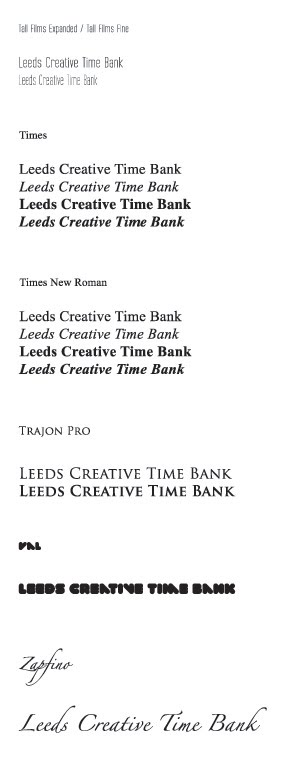
Both myself and Boysie like the direction this logo is heading. We still have time to experiment with the different identities before sitting down and planning a currency system and / or digital form of this time bank.


Creative Time Bank (Logo Development)

After selecting several different fonts, it was time to experiment with some of them to see what kind of composition and format the logo could fit. I started by using on of my favorite fonts: Val, this is a soft, bold and creative font which I feel would represent the creative time bank very well.
This is just some initial development, i will be further exploring the font, and the layout to see what can be done with this type based identity. The theme both myself and boysie and lookin for at the moment in terms of the identity is old meets new. We like the idea of the logo being some sort of crest, with 2 apposing fonts. Possibly a sans-serif and a serif.


Sunday 30 January 2011

Creative Time Bank (Type Selection)

A key issue in any brief to me, is the type. Both myself and Peter immediatley wanted to establish a typeface which we could use across the range which we will be pitching to the client on the 7th February. We both wanted to use a sans-serif type, but we thought it would be appropriate to look at all possible variations, including serif fonts.
We narrowed our search down to 3 type, and in the end we opted for Myraid Pro. Although this is a standard font on illustrator, we thought its weight, readability and legiability made it a safe winner to be used across the range we produce.


Time Banking UK

Yellow seems to be a running theme with these time banks. As yet another time bank uses a tone of yellow in its identity. I have found this site, out of the ones i have found so far on my research the most informative. The language is simple and easy to understand, its legiable and very effective in terms of finding your way around the site.
This particular example is a time bank for persons of any profession, with time on their hands. However, and this is a part of the brief im uncertain with. This particular time bank has a members fee of £35 per annum, as an individual. The expense baffles me, as if you register and organisation, its £100 per annum for (UP TO) 150 members?? Well thats a clear loophole in this system, i will get 150 of my best friends together, join as an organisation and pay just 66p per annum, each.

It is to my understanding that our system does not have a joining fee. And this makes sense too me, who would want too pay £££ to join a free time system?

The latest statistics for time banks in the UK are (According too Time Banking UK)

  • 92 active time banks
  • 112 developing time banks
  • 2 neighbourhood time banks
  • 14514 participants actively involved in time banking
  • 792027 hours traded between participants to date


Time Bank (London)

This example is much like the previous post (.org.uk) as this site is based purely on volunteering in and / or around London.

'TimeBank London is a new resource designed to help you find a way to volunteer in London. The website is built to direct you to an assortment of organisations and projects around London, who are in need of volunteers. London offers a variety of opportunities, ranging from mentoring refugees to media training young people, helping children to read to regenerating your local environment. Whatever your skills and interests TimeBank London can point you in the right direction.'


Although there wasn't much too print screen on this site, i found the members area and search engine very appropriate to what we are trying to achieve. Looking at this site has helped us determine what we want to provide on the website and what we feel is and is not appropriate. Looking at this site, it is clear the structure and usability of the site is essential to this brand performance and future growth.


Saturday 29 January 2011

Time Bank (.org.uk)

Next stage of my research was to look at other Time Banks around the UK. The example i have found here is not a creative directed time bank. This system is volunteer based, its ' .. a national volunteering charity that supports individuals and businesses to find rewarding volunteering. We also design our own projects that give volunteers the opportunity to have an impact in the community.'
I found this site more intreeging. The design is a lot more effective, the colour pallet is minimal and works across the whole site to make it its own. I really like the layout of the site, its once again practical and easy to navigate, its informative and friendly.
The identity is simular to the Leeds based time bank, using a circle and a restricted colour pallet, however it does feel as though more time has been taken on this logo, in terms of type and colour choices.
Another point to be made is the organisation of the pods. They are performing the same tasks as the Leeds website does, however its more understandable and user friendly. This is a good example to bear in mind when the design process turns towards the website.


Time Bank (Current Webite)

After the briefing. Both myself and Peter immediatley set to work, researching existing Time Banks around the UK. Obviously we started with the Leeds branch. Upon logging on to the website, we found it wasn't really very 'creative.'
The website is actually a blog (http://leedscreativetimebank.blogspot.com/). This is not a good first impression to myself, it should be bold and creative, to stand out to the target audience of designers, who really want to see design.
The logo is a limited colour pallet design, which uses a basic sans-serif typeface. The colour choices are not brilliant either. The yellow drowns out the 'Time Bank' and when looking at the logo, its the black type which draws my attention.
As for the layout, its a very simple straight forward blog design. I feel the colour are just too much and i immediately think of a holiday website, or a cleaning product.
It is fair to say however, that the website is very informative. There is all you need to know on this site, and its been very well put together and pitched across to potential members. At this point though, i feel it could be organised a bit more direct and effectively. Below are some screen shots from the site, so you can get a better understanding of what i mean.


Now i have researched this existing site, i will look into other Time Banks that exist around the UK, and how they have branded and promoted themselves.

Friday 28 January 2011

Shammix (Developed)


Shammix (Logo Development 3)

Development for the Shammix logo has further developed below. One of the fonts which i decided to start experimenting with was a strong contendor for the finalised logo. However some of the letterforms were not legiable or looked simular to other letters.
I had some real trouble with the 'x' for both the abbreviated and full identity. At this point it was rite to try and produce the letterform again, making it clearer to the audience. At the same time i played around with the form of both the 's' and the 'h' for the abbreviated identity. Below are the final series of resolutions which show the development clearly. The first example is the letterforms in their standard form (minus the black square above the 'h').


Misc Logos 2

More identities which i have researched below. All these examples are type based and are focused on the layout and format of the piece. I feel these examples reflect the design direction my client wishes for me to take. The fonts used for these logo and beautifully rendered and the majority (except 1) are legiable and readable, which again, is a big issue to both myself and my client.
This part of my research has helped me in the direction to take the identity, and also helped me identify ways in which i can display my logo designs on a website. Watch this space.


Misc Logos

As a part of the Shammix brief, my client wants a smaller illustrated logo. My client did his research into existing pieces like the Deadmau5 illustration. This part of the brief is a big vague though, and i feel that i may leave this part of the brief until after i email him later today with 3 developed logos. This will give me a basis in terms of weight, stroke and composition i have to work with, with the chosen logo.
The examples below are some of my favorites. They are simple, yet affective and carry humour which is brilliant for the viewer.
From this point i will also be looking at the colour pallet, unless my client has already made his mind up. The next few days will be very experimental in terms of my design direction, hoever i feel confident with the progress made so far.


Tempa.

Through my research i found this re-brand and product development. Tempa. is a dubstep and garage record label run by Ammunition Promotions. The label was established in 2000 and saw a re-brand in 2006. I took these examples as this is what i feel my client is after, he wants an identity which is solid, heavy and bold.
Although the example below is a re-brand for a record label not an artist, the same design principles apply. The genre of music Tempa. caters for is simular to that of Shammix. Looking at these high end print vinyls and how the logo can be adjusted to work with the print techniques i feel confident in the direction i wish to take this brief.
However i feel before i rattle my design down to a final 2 or 3, i need to do more research to look into existing identities for artists and labels alike.


Thursday 27 January 2011

Time Bank - Brief

Shammix (Logo Development 2)

Further development with the Shammix identity. Here i have decided to go in the direction of legiability and readability. I have purely taken some time to experiment with the form, point size and kerning of the type.
Some of the resolutions are more succesful than others. There are a few points which i can take forward from each design, to help create a stronger, more eye-catching and memorable identity than the ones below.
I feel that once i start designing an abbreviated version of the Shammix logo reading SHX - then the identity will come together a lot quicker.


Wednesday 26 January 2011

Dimko (Identity)

As mentioned in the previous design context post for the Shammix brief: My client would like a type based logo, with a illustrated character as a back-up identity / promo piece.
I found this example which is very simular to a piece a sketched up when my client first infromed me of this part of the brief.
The below example is for a DJ by the name of Dimko. I have added this post to show what my client is after, and to remind myself which 'characters' already exist.
Again my client has given me freedom in terms of colour pallet and character theme, however i am feeling the pressure from this, as illustration is not my strong point. A potential collaboaration maybe with an illustrator? We shall see.


Sunday 23 January 2011

Shammix (Logo Development 1)

Below are some of the initial developments for the Shammix logo. The client has asked for the logo to be approachable, bold and eye-catching. I do not feel that the resolutions below will be to the clients taste at all. These are only initial ideas, so its back to the drawing board to create fresh pieces.

What the client wants:

  • Type based identity
  • Illustrated character if possible
  • A bold design
  • Limited colour pallet