
With the logo developing well, i decided it was time to go onto the Boost website to look at current range of flavours and bottles/cans which were being distributed.
I was immediatley struck by the range of their products, being honest i thought they had 2 flavours of beverage to their name. Although this did shock it, it also made me feel more confident in the direction i should take the logo, to work across the range of products.
Boost Sport - The design includes photographed fruit, the standard logo horizontally placed apposed to vertical like some of the other products.

Boost energy (+Cola) - In this range, there are cans, medium and large bottles. There are two flavours, original and cola. The logo is placed vertically with minimal design in terms of colour pallet or imagery.

Boost Active - Much like the Active range, 2 bottle, 2 flavours, logo placed horizontally and a little bit more effort in terms of design, but still not good enough to stand out amongst its rivals.
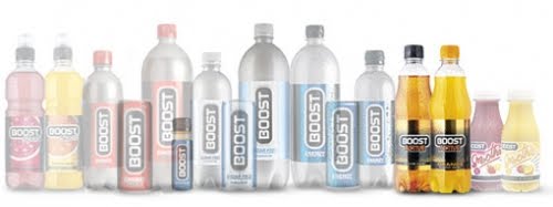
Boost Smoothie - My favorite of the range, small and well designed. Again the logo is placed horizontally and the imagery is very professional and gives the audience the immediate message of a smoothie.

All in all, i feel Boost is letting itself down in terms of being professional, and standing out from the rest of its rival products like Red Bull and Monster.
No comments:
Post a Comment