Monday, 23 May 2011

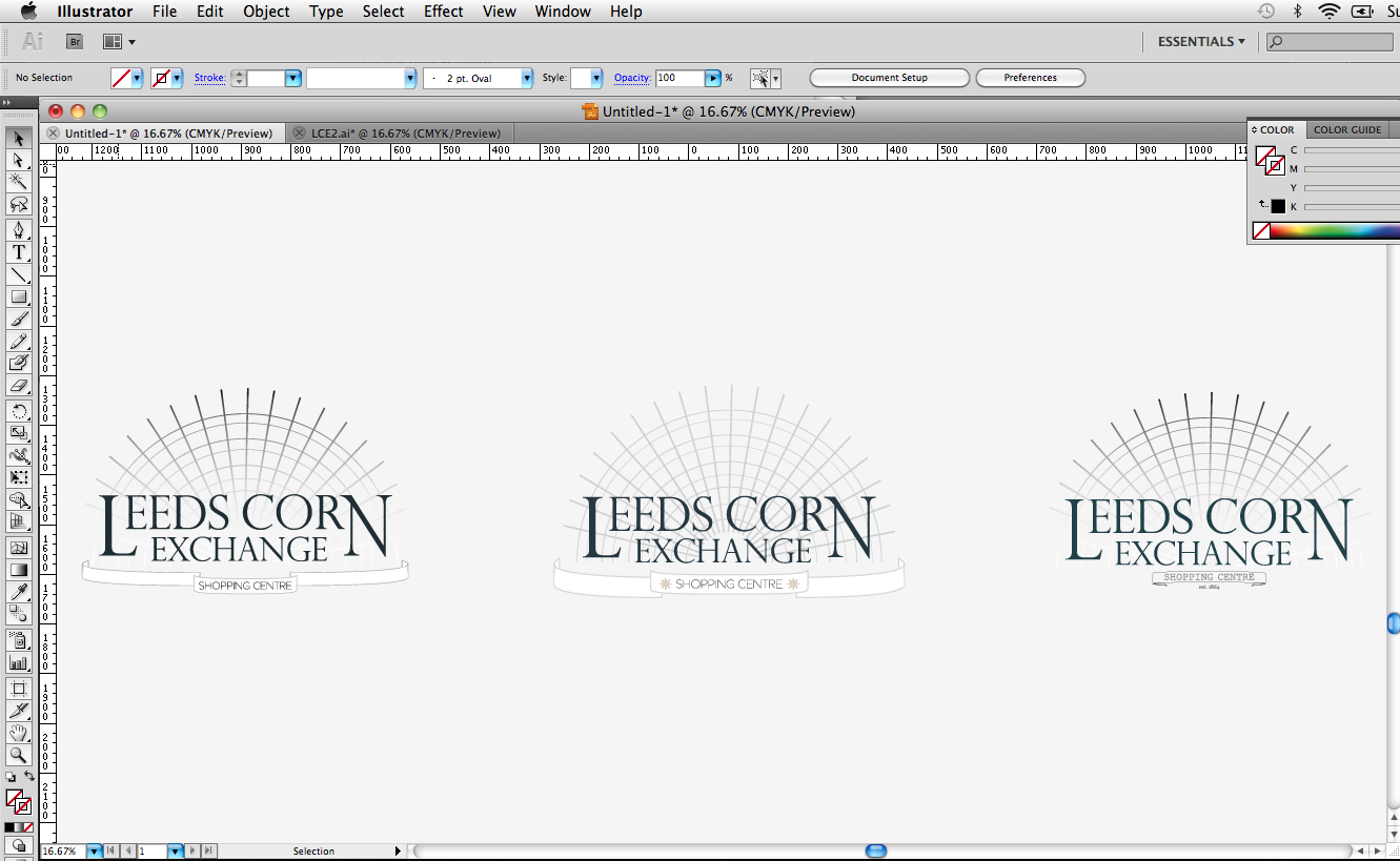
Leeds Corn Exchange (Type Development)


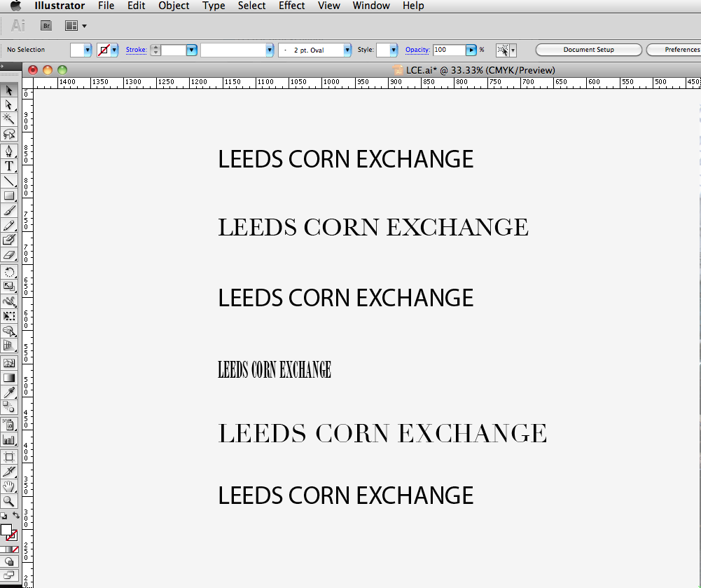
Leeds Corn Exchange (Type Selection)

Since finding this live brief through facebook, I decided to jump straight into it. I began with selecting typefaces that I felt carried the tone of voice of the Leeds Corn Exchange. I narrowed the list down to several that I wanted to develop further.

Wednesday, 11 May 2011

Hannah Matthews (Brand Guidlines)

Hannah Matthews (Business Cards)

Below are the final business card design. I didn't want to use the standard format for the business card, I felt this format framed the logo better and asthetically is a lot better.
I have started looking into printers, and spoke to my client about the possibility of limited edition aluminium business cards, which will run alongside her new range.

Tuesday, 26 April 2011

Hannah Matthews (Final Logo)

Here are the final logos for Hannah Matthews. I'm very pleased with the final resolutions, and feel they represent my client really well. I feel i have acheived the rite tone of voice, and met the criteria in terms of my clients target audience and appeal.
When in the last crit, I asked my group to describe the logo in 3 words. My feedback was great, and words like: sophisticated, clean and british were used.
Next stage - business cards and stationary.