I went with a bold typeface to keep viewers attention and for legiability at a smaller scale. So far im pleased with how these designs have come out, although I do not feel that they represent a 'Summer Rave' in terms of the colour pallet. I want to keep the colour minimal, for printing costs - plus I felt that black was to dark and heavey for the theme.
![](https://blogger.googleusercontent.com/img/b/R29vZ2xl/AVvXsEjczaik1voeaIEnYhZ0nEAkERcS5qDXUNm408eoV8WYkNlrhS-bZY1IzqvuHsnKe40vxpdFHDXCHzDejy3SBqKvhNuHFL66q7OnISdxFg-ninmDvsYKaEduDgmOw4SKAAVkmYYnxUnKmPY/s320/SHX%252823Poster%2529.jpg)
![](https://blogger.googleusercontent.com/img/b/R29vZ2xl/AVvXsEjBHFAiuqbiIlFWPNVGEfUHJLHiNv32yxfgZuEu-EE_UuZnu5XehjYyCc34gylf-jq5Z3pQsyVtYGrX3bq3MDqM8BNSiqQNyQk9dD_RCfJfpJHZof8-LY5gynrL7Wp_P_DQrL-RoHu_fsE/s320/SHX%252823Flyer2%2529.jpg)
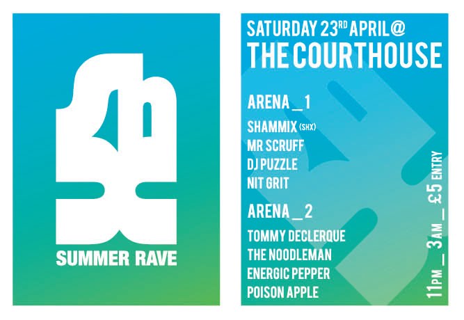
Below I have used a gradiant of blue and green. This is much more summary, and runs well with the theme of a summer rave. I also feel the colour pallet is more eye-catching and unique than a standard black and white flyer and poster.
![](https://blogger.googleusercontent.com/img/b/R29vZ2xl/AVvXsEjW1c3WoFH3-jjSIMNbaiLnQLsvmJ6w2OxoLgUgL_5bo49PXPRykGoBhPUNu4GNpTTgF4MNXxEtK6M1xFhxbPbLzVWLJgcjbiRYAzojxokEjTk2XDK8iOJVs_4gi1AqDBMV3-8MEX5gvxY/s320/SHX%252823NewPoster%2529.jpg)
![](https://blogger.googleusercontent.com/img/b/R29vZ2xl/AVvXsEjuGzd8LVHKDXMac5-O5GKpB4zmHrf8vTWVgs-WwbIeh_fOAkm6Isv517FOuY_PSidPRci7tZvLCwfzTl_s2umHZl0wATAQ57Zi9SyLNttfNVaaUOXKy8kWggH4S9xWXGfm1Yy46Zndj7Y/s320/SHX%252823Flyer%2529.jpg)
No comments:
Post a Comment