Thinking back to my final major project, I come away some what satisfied with what I have achieved. I feel I used the time available to me wisely in the last few weeks, but really wasted time in the initial few weeks. I walk away from this module holding my head high, after producing some of my best work, and being able to turn briefs around within a couple of days.
Relating each of my briefs back to my rationale, I feel I have kept on track and been rather focused in how my work has been finished and presented. I feel I have been consistent throughout each of my briefs, giving myself good time limits and reasonable deadlines. The transition I have made from the previous module to now is of a high standard. Although I did not produce merely half as many final products as the previous module, I feel the finishing details in my work really do bring each piece to a professional standard.
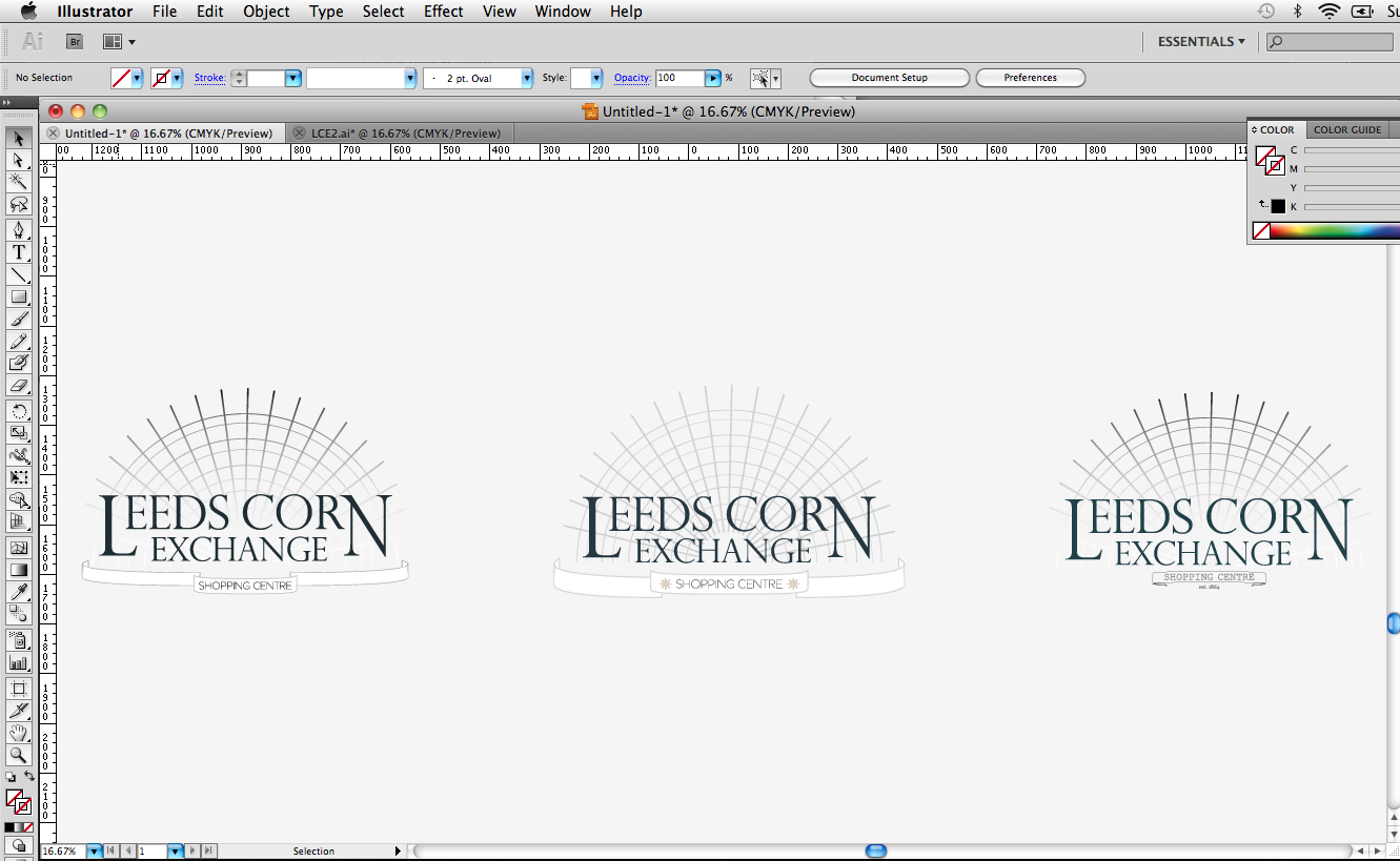
I found dealing with one of my clients very difficult during the FMP, and what was to be a rather large brief (Shammix) turned out to be a bit of a shamble. With the client changing his decisions every time we spoke, it really became difficult to keep motivated during that project. My other briefs however were very different, one of my significant briefs came from the Leeds Corn Exchange who were holding a competition to re-design their logo to win an iPad. I decided to go ahead and have a go at the competition, but make the small brief significant by producing brand guidelines, shop signage, entrance signage, bags, t-shirts etc. I am very proud of the work i produced for this brief, and feel I hit the nail on the head after finding out I had won the competition.
A huge let down for myself was the amount of time I actually spent blogging. I did not appreciate the blog as a 'back-up' of work or to show the development process throughout each brief. It's not a case of myself being lazy, but I am aware this has been a floor in terms of my final major project, and that I could loose valuable marks from this.
The FMP as a hole has been very enjoyable, a very big learning process, within dealing with clients, other professionals, real deadlines, real budgets etc. I found that working as a collaborative team on the Graphic Design yearbook really was a valuable experience. Working alongside 3 other talented designers was a privalage, and I feel we produced a fantastic product and can walk away from this module with a huge sense of achievement.
I know where my weaknesses are as a designer, and I know how to be more professional in terms of organization and meeting the deadline. I am hugely proud of what I have produced for this module, I know I could have done a lot better in some areas, but thats the way the cookie crumbles. I feel i used all resources available to me well, including the visiting professionals, portfolio reviews, workshops around the college and one on one feedback from staff. The FMP was very enjoyable, and i'm proud I made it this far, it has been an honor studying at Leeds College of Art, I'm hugely proud to have been accepted, and to have completed what I consider the toughest degree course at our college.

Friday, 3 June 2011
Thursday, 2 June 2011
Leeds Loves Creativity (Final Boards)
Leeds Loves Creativity final boards. Another quick turn around brief, which i produced the final logo and put this across some range as posters and flyers. I also put some of this into context and the brief was completed within several days.
Hannah Matthews (Final Boards)
Hannah Matthews final boards. These are the final boards to show how I took the final logo resolution and took it across a range including the promo pack, business cards and stationary set. I was really happy with the range I produced and the quality and finish for each design.
End of Year Show (Final Boards)
End of Year Show final boards. This was a quick turn around brief, during which I came across some technique problems which caused me to miss the deadline.
Creative Time Bank (Final Boards)
Creative Time Bank final boards. This was an enjoyable brief that was a week long. It was a collaborative project with Peter Sands. After the Time Bank briefing, we and Peter set some time apart during each day to have a meeting and develop our concept.
Yearbook (Final Boards)
The final boards for the Yearbook brief. This was a very enjoyable and at some points stressful brief. It was yet another great opportunity to work collaboratively as a team with 3 other great designers. The experience gained in dealing with and talking to industry professionals has been fantastic.
Shammix (Final Boards)
Final boards for my Shammix brief. After a lot of messing around and mislead clint feedback, finally a logo resolution was finalised and a small but significant range was produced. This was not the most enjoyable brief, however it was useful to collaborate with Jonny Packham, who produced the illustrations for album artwork and tickets.
Leeds Corn Exchange (Final Boards)
Leeds Corn Exchange final presentation boards. These boards show the development and range covered throughout this brief, from the final logo resolution through to the entrance and shop signage.
Boost Re-Brand (Final Boards)
Here are the final boards for my Boost Re-Brand. The boards show the development from the logo across the range covered.
Friday, 27 May 2011

Thursday, 26 May 2011


Wednesday, 25 May 2011


Tuesday, 24 May 2011


Monday, 23 May 2011


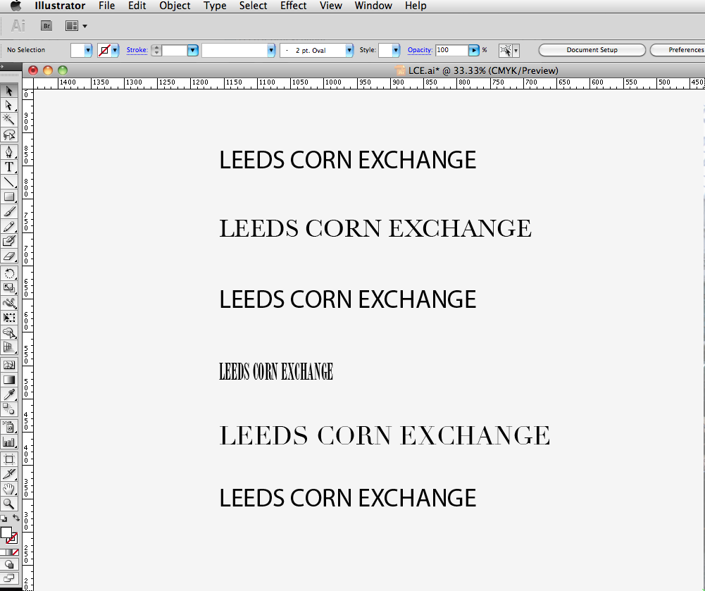
Leeds Corn Exchange (Type Selection)
Since finding this live brief through facebook, I decided to jump straight into it. I began with selecting typefaces that I felt carried the tone of voice of the Leeds Corn Exchange. I narrowed the list down to several that I wanted to develop further.

Wednesday, 18 May 2011


Wednesday, 11 May 2011

Hannah Matthews (Business Cards)
Below are the final business card design. I didn't want to use the standard format for the business card, I felt this format framed the logo better and asthetically is a lot better.
I have started looking into printers, and spoke to my client about the possibility of limited edition aluminium business cards, which will run alongside her new range.

I have started looking into printers, and spoke to my client about the possibility of limited edition aluminium business cards, which will run alongside her new range.

Tuesday, 26 April 2011
Hannah Matthews (Final Logo)
Here are the final logos for Hannah Matthews. I'm very pleased with the final resolutions, and feel they represent my client really well. I feel i have acheived the rite tone of voice, and met the criteria in terms of my clients target audience and appeal.
When in the last crit, I asked my group to describe the logo in 3 words. My feedback was great, and words like: sophisticated, clean and british were used.
Next stage - business cards and stationary.


When in the last crit, I asked my group to describe the logo in 3 words. My feedback was great, and words like: sophisticated, clean and british were used.
Next stage - business cards and stationary.


Hannah Matthews (Logo Dev 6)
Below are several different directions i took with the logo. The examples immediatley below show the logo with a frame / crest - however after looking at it for a while it started looking more like a shop sign apposed to a logo.
I feel there are strong aspects within each design, and a final resolution could be produced using these details in one design. I will be keeping the typefaces used in the examples below, however extra details maybe added.


I feel there are strong aspects within each design, and a final resolution could be produced using these details in one design. I will be keeping the typefaces used in the examples below, however extra details maybe added.


Monday, 25 April 2011
Hannah Matthews (Logo Dev 5)
After another meeting with my client, I was informed she wanted a small pictogram which could sit alongside and on its own with her work.
Because her work is based around florals and musty colours, I felt a single rose would represent her well, and sit well with the finalised logo.
The grey example below is the final rose, it was difficult to decide on a final layout and scale for the rose, however this is looking strong at the minute, and once the logo has been finished, I'm looking forward to seeing them both together.


Sunday, 24 April 2011
Hannah Matthews (Logo Dev 4)
After looking through endless amounts of typefaces, I finally found one that I feel represented and carried the tone of voice of both my client, and her work.
The examples below are once again quick compositions, which give me an idea on the smaller details and layout of the logo. I feel I am getting close with this now, however as mentioned above, these are just the experiments.

The examples below are once again quick compositions, which give me an idea on the smaller details and layout of the logo. I feel I am getting close with this now, however as mentioned above, these are just the experiments.

Hannah Matthews (Logo Dev 3)
After the intial experimentation using my clients initials, it was clear that that direction was a lost course. After speaking to her, we both decided to experiment more with the hand written type, but this time using her full name, apposed to her initials.
These designs have come out well, I'm reasonably pleased with the resolutions, however when putting the logo next to (and) within her work, it was clear it did not fit or represent her as a designer. So the decision was made to follow on with more traditional typefaces.

These designs have come out well, I'm reasonably pleased with the resolutions, however when putting the logo next to (and) within her work, it was clear it did not fit or represent her as a designer. So the decision was made to follow on with more traditional typefaces.

Thursday, 21 April 2011
Hannah Matthews (Logo Dev 2)
Again some experimentation with my clients initials. This time I have used a hand-written typeface to see how I can manipulate the letterforms to use a minimal amount of stems and to link the letter together.
I do not feel that this technique is working, and that if i'm not careful I will end up polishing a turd. Time to move on, and start experimenting with full name layouts.

I do not feel that this technique is working, and that if i'm not careful I will end up polishing a turd. Time to move on, and start experimenting with full name layouts.

Wednesday, 20 April 2011
Hannah Matthews (Logo Dev 1)
Just a quick experiment to see how I can play around with the composition of my client initials. I am worried that people would immediatley associate HM with the H&M logo.
These are very quick experiments, which have given me a series of questions for my client - including an abreviated logo or full name, colour pallet and type selection.

These are very quick experiments, which have given me a series of questions for my client - including an abreviated logo or full name, colour pallet and type selection.

Hannah Matthews (Branding)
Initial stages of the Hannah Matthews branding. Type selection is essential to represent a brand, after speaking with my client and looking at her work - it was clear that a traditional typeface with looks typically british and sophisticated would work. Below are several different type faces that I have selected to take forward.
My client also likes hand written type, and would like to see some designs using this. However I have given my opinion and said I would design to the direction I felt represented herself and her work.

My client also likes hand written type, and would like to see some designs using this. However I have given my opinion and said I would design to the direction I felt represented herself and her work.

Tuesday, 19 April 2011
Boost - Can Mock-Ups
It's nice to finally see a design printed and mocked-up (as best i could). But what these images show me is how the design is working. I have kept to the rule of the Golden 3rd and kept the logo as the fundamental view point of the can, and allowed the artwork to take a back seat, however still filling the space, with a good concept.
The colours have come out well, although I feel the blue used on the Sugar Free can, needs to be the same pantone colour as the Energy drink.
The next stage of this process is to get the design printed onto flat aluminium, which will show me if the colour work or not. It will also get rid of the white sections in the artwork, which will be replaced with the silver of the aluminium (making it cheaper to print)


Friday, 15 April 2011
Boost - Final Can Artworks
Finished and ready to be printed for the mock-ups - 3 of the artworks for the cans, which seperate the range through the use of colour and a type detail.
The labels below are for:
1 - Boost Energy
2 - Boost Sugar Free
3 - Boost Cola
After establishing a concept, it was a fairly simple process to produce an artwork to work. Using small details for electronic pictograms and the use of colour, it was easy to split the range apart to work on their own or together.
Next step - Trying these prints on a mock-up can.

Wednesday, 13 April 2011
Boost - Label Development 2
Because I now have a considered concept behind my can artwork - I decided this is an appropriate time to get the layout of the logo and type in order (the type being the ingrediants, recycling details, nutrition values etc)
The colours selected below will also be used in the final designs. I looked at the existing artworks for the Boost cans and found that the seperation between each product is obvious through a small detail in the colour. The first and third examples below will be the standard Energy drink, and the Silver (white) label will be for the sugar free drink.
The design at the bottom shows the correct placement of the logo and type (at this point) as this allows the space for the artwork and legiability.

Sunday, 10 April 2011
Boost - Label Concept
The artwork to go on can designs is a very important issue. After picking my brain for a while I was finally able to come up with a concept which covered the products name (Boost) and what it does (Gives Energy).
I decided to look back into my old school electronic work, where switches, diodes and circuits all produced some sort of energy. The image below along with my key explains it better:
Putting it simply, the Supply is the Boost drink and through the process of opening the can, the customer recieves the energy (load).

Below: Some development of the artwork, which will include small details from electronic pictograms.


I decided to look back into my old school electronic work, where switches, diodes and circuits all produced some sort of energy. The image below along with my key explains it better:
- Supply = Boost (Drink)
- Switch = (Ring Pull)
- Diode = Direction
- Load = Customer
Putting it simply, the Supply is the Boost drink and through the process of opening the can, the customer recieves the energy (load).

Below: Some development of the artwork, which will include small details from electronic pictograms.


Saturday, 9 April 2011
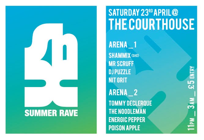
Shammix - Flyers and Posters 2
For the 2nd part of the Summer rave featuring Shammix, I went for a different layout and once again using a lighter colour pallet. The colour pallet is also in theme with the venue (The Outback) which is an australian sports bar - and this flyer using spot colours from their own logo, to help the audience understand where the venue is.
Next job is to get these printed and see how the type is working in terms of legiability and readability. Job after that, pricing up 'x' Number of copies (according to my clients needs)


Next job is to get these printed and see how the type is working in terms of legiability and readability. Job after that, pricing up 'x' Number of copies (according to my clients needs)


Thursday, 7 April 2011
Shammix - Flyers and Posters
After experimenting with the type and layout of both the posters and the flyers, I finally found a good way for the posters and flyers to be read. I decided to promote Shammix from the start, making the logo the header and most important aspect of the evening.
I went with a bold typeface to keep viewers attention and for legiability at a smaller scale. So far im pleased with how these designs have come out, although I do not feel that they represent a 'Summer Rave' in terms of the colour pallet. I want to keep the colour minimal, for printing costs - plus I felt that black was to dark and heavey for the theme.


Below I have used a gradiant of blue and green. This is much more summary, and runs well with the theme of a summer rave. I also feel the colour pallet is more eye-catching and unique than a standard black and white flyer and poster.

Wednesday, 6 April 2011
Shammix - Promo Development
After finally finishing the full and abbreviated Shammix logos, it was time to start the promotion process. Shammix will be performing 3 - 5 sets over the summer period, titled the 'Summer Rave' I have decided I will break each performance into a Part.
This allows me to produce flyers and posters with a different colour pallet and layout for each to stop confusion of the same venue, dates etc.
Below are some quick experiments to see how i could fit the abbreviated and full logo onto an A6 flyer. The format is small, and both of the logos are hard to fit to it, but its best to discover these problems now before its too late.

Tuesday, 5 April 2011
Boost - Label Development 1
Starting the label artwork is a big task. After some great advice from Lorenzo where I was told to consider the Golden 3rd, which is the section of the cans artwork that is most important to the potential customer, I have started to produce a basic layout to work too. This will allow me to consider colour, type choice, and layout. What I really need at this point is a concept for the artwork - it's all good drawing a pretty picture, but I feel a rebrand like this needs a strong concept for the artwork to go alongside the new identity.


Monday, 4 April 2011
Shammix (Final Logo?)
Shammix logo at its final point. The client wanted the all the letterforms joined, which i was happy to do, however when i joined the 'm' and 'i' it became illegiable, and made the whole design feel cheaper. The version below has all the letterforms joined up, the 'a' into the 'h' looks really nice, with a slight stroke on the outside to break it up.
Im pleased with how these have come out, i feel it has taken me too long to get to this point however, due to other brief commitments. Now comes the fun part of putting the logo across the range. Including venue tickets, flyers, posters, album artwork, limited edition vinyls etc.

Im pleased with how these have come out, i feel it has taken me too long to get to this point however, due to other brief commitments. Now comes the fun part of putting the logo across the range. Including venue tickets, flyers, posters, album artwork, limited edition vinyls etc.

Yearbook Presentation
As promised at the recent yearbook presentation, below is the PDF for the rest of the class to view. We feel the presentation went well, and the feedback was very possitive.
We produced the presentation to cover the main issues of the yearbook, including:
We produced the presentation to cover the main issues of the yearbook, including:
- The Concept
- Cover Designs
- Image Treatments
- Visiting Professionals DPS
- Student DPS
- Tutor Quote DPS + SPS
- Class Shot
- Type Face + Colour Pallet
Monday, 28 March 2011


Subscribe to:
Comments (Atom)