Wednesday, 2 February 2011

Creative Time Bank (Logo Development 7)

Below are a series of designs which show the direction the time bank identity has taken. I decided to start experimenting more with the colour pallet and format of the logo.
Each of the design uses the same colour pallet, however the colours are layed out in different positions on each resolution. The colour pallet was an ovbious choice, using cyan, magenta and yellow. I tried using black, however it was not as legiable as the white, which complimented all the colours in the logo.
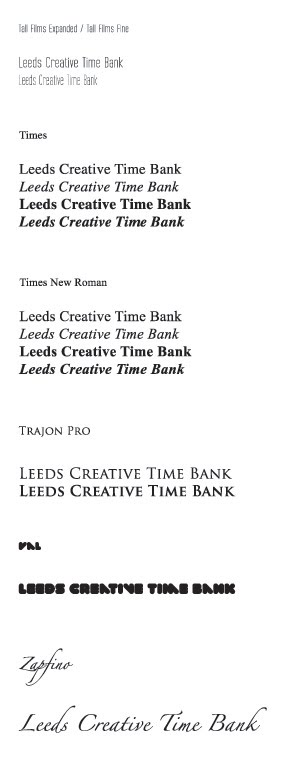
The final series of 3 logos show the direction in which the type has taken. After a lot of experimenting both me and boysie have found this font, which we feel really will set off the old vs new concept of our planned logo.


Creative Time Bank (Logo Development 6)

So this is a series of logos which I took in a different direction. The reason for this was purely experimental and to show further development.
If im honest i have a thing against identities inside circles, they tend to irritate me. However i decided to give it a go with the creative time bank just for the sake of it. These designs turned out okay, some of the colours worked, others didn't, however this has taken me to another direction i could take the identity in. I feel the light blue, purple and white circles worked the best and that they complimented the type really well.
I do feel though, that although the original identity was inside a circle, that the client would like to see something a bit different and if it used circles, it would have to be in a different form.


Tuesday, 1 February 2011

Creative Time Bank (Logo Development 5)

After having a play around with the fonts which were going to be used, i finally picked the one i felt worked best with Val. Because me and Boysie like the idea of old meets new, we decided to direct the logo in a crest direction. The resolution turned out to be very nice, however the colour pallet was the next problem on the agenda.
I experiemented with soft tones and dark tones of each colour, but below i have shown you some of the better ones which came out of this process.
I felt the green versions worked well, however during a talk with one of my tutors, they commented on how the colour and the Val typeface together, makes the viewer immediatley think it reads Green. A fair point i thought, so it was back to the drawing board to see what else we could produce.


Creative Time Bank (Logo Development 4)

Refering back to the previous post in which we saw the development of several identities, it was decdied that i would go back to the third design and experiment with the selected fonts which would be used in the design.
Belows image shows the development and selection of typefaces and other smaller details including the 'ribbons' on either side of 'Bank'.
Me and Boysie are still fairly unsure about the logo at the minute, because although we understand the concept, would a random viewer? Well this is what we must find out.


Creative Time Bank (Logo Development 3)

I decided to take the logo a bit further using the Val font. I wanted to explore the different layouts that could be used for the final resolution. As mentioned in a previous post, both myself and Boysie liked the concept of old meeting new in terms of the time banks identity.
Below are 3 directions in which the identity took, which myself and Boysie felt were relevent and answered our concept.
We prefered the second and third designs due to the look of a vintae crest and because of the mix of typefaces, which really do compliment each other.
At this point we feel the third logo needs further development, in terms of the second font, sans-serif or serif, old or new? These are questions which now must be answered.


Monday, 31 January 2011

Creative Time Bank (Logo Development 2)

Keeping with the Val font, I decided to have an experiment with the layout and readability of the word creative. I wanted to make the viewer reader the examples below as 'Creative Time' so experimenting with weights, tones etc was essential to make this concpet clear.
Both myself and Boysie like the direction this logo is heading. We still have time to experiment with the different identities before sitting down and planning a currency system and / or digital form of this time bank.


Creative Time Bank (Logo Development)

After selecting several different fonts, it was time to experiment with some of them to see what kind of composition and format the logo could fit. I started by using on of my favorite fonts: Val, this is a soft, bold and creative font which I feel would represent the creative time bank very well.
This is just some initial development, i will be further exploring the font, and the layout to see what can be done with this type based identity. The theme both myself and boysie and lookin for at the moment in terms of the identity is old meets new. We like the idea of the logo being some sort of crest, with 2 apposing fonts. Possibly a sans-serif and a serif.


Sunday, 30 January 2011

Creative Time Bank (Type Selection)

A key issue in any brief to me, is the type. Both myself and Peter immediatley wanted to establish a typeface which we could use across the range which we will be pitching to the client on the 7th February. We both wanted to use a sans-serif type, but we thought it would be appropriate to look at all possible variations, including serif fonts.
We narrowed our search down to 3 type, and in the end we opted for Myraid Pro. Although this is a standard font on illustrator, we thought its weight, readability and legiability made it a safe winner to be used across the range we produce.


Time Banking UK

Yellow seems to be a running theme with these time banks. As yet another time bank uses a tone of yellow in its identity. I have found this site, out of the ones i have found so far on my research the most informative. The language is simple and easy to understand, its legiable and very effective in terms of finding your way around the site.
This particular example is a time bank for persons of any profession, with time on their hands. However, and this is a part of the brief im uncertain with. This particular time bank has a members fee of £35 per annum, as an individual. The expense baffles me, as if you register and organisation, its £100 per annum for (UP TO) 150 members?? Well thats a clear loophole in this system, i will get 150 of my best friends together, join as an organisation and pay just 66p per annum, each.

It is to my understanding that our system does not have a joining fee. And this makes sense too me, who would want too pay £££ to join a free time system?

The latest statistics for time banks in the UK are (According too Time Banking UK)

  • 92 active time banks
  • 112 developing time banks
  • 2 neighbourhood time banks
  • 14514 participants actively involved in time banking
  • 792027 hours traded between participants to date


Time Bank (London)

This example is much like the previous post (.org.uk) as this site is based purely on volunteering in and / or around London.

'TimeBank London is a new resource designed to help you find a way to volunteer in London. The website is built to direct you to an assortment of organisations and projects around London, who are in need of volunteers. London offers a variety of opportunities, ranging from mentoring refugees to media training young people, helping children to read to regenerating your local environment. Whatever your skills and interests TimeBank London can point you in the right direction.'


Although there wasn't much too print screen on this site, i found the members area and search engine very appropriate to what we are trying to achieve. Looking at this site has helped us determine what we want to provide on the website and what we feel is and is not appropriate. Looking at this site, it is clear the structure and usability of the site is essential to this brand performance and future growth.