Monday, 7 March 2011

Shammix (Logo Development 6)

As mentioned on the previous post, i wanted to produce an abbreviated version of the Shammix logo. The first 3 examples below are the abbreviated identities - which im very pleased with. I like to play around with type, and because this is a shorter, more direct identity, i feel it can be playful, intriguing and inviting.
I like all 3 of these designs, however i would prefer to develop the 1st and 3rd design. I feel these two designs have more too them, and with some colour added could be very vibrant, and even work with imagery.


The 3 resolutions above were developed from the abbreviated identities i produced at the top of this post. These designs are harder to understand than the originals, and have issues with legibility and readability. I do feel however, that they are aesthetically pleasing, and that the 1st and 3rd designs once again work best and could be developed further, depending on my clients feedback.

Shammix (Logo Development 5)

The Shammix logo has taken further development since the last blog post. After visiting my clients sound cloud page, i saw how he has typed out 'Shammix' and felt i should try and develop the indentity in the same way. 'Shammix' was typed out 'ShAmMiX' so i felt playing with the upper and lowercase, point size and stroke of the typeface would come out with a solid resolution and a clearer design direction.
You can see below how in each of the resolutions i have experimented with the form of the design. Experimenting with the kerning between each letterform and the point size was also experimented with. Some of the resolutions are better than others, however i feel the 2nd, 3rd and 5th resolutions work the best.

Whats next? An abbreviated version of the Shammix identity.


Shammix (Logo Development 4)

After emailing my client last thursday, it was made clearer to me the direction which they wanted me to take their logo in. The client (Shane) commented on a previous blog, saying how he liked how the two 'm's in the name were joined.
Shane also wanted the identity to be in a more stylised typeface, one which would be instantly recognisable and memorable to Shammix - this meant steering clear of both Arial and Helvetica.
The designs below have been developed from this point forward. There are a couple of strong concepts coming along at the minute, but these resolutions still need further development.


Saturday, 5 March 2011

Boost - Logo Development 7

After finally sorting out the direction of the logo, I have decided to look into colour and the use of the gradiant tool. The examples show selected colours which represent the logo itself well. However I feel i need to look back at the current range of Boost products to get a better understanding and direction for the colour pallet and extra details to be included on each design. For example:

  • Boost Energy
  • Boost Sugar Free
  • Boost Cola
  • Boost Sport (2 Flavours)
  • Boost Smoothie

Shammix - Logo Feedback + Development

After emailing my client and asking for some feedback on the development made so far - he replied swiftly and mentioned the design below.
He commented on how the 'mm' in shammix was joined, and that this is the direction in which he wanted the identity to go in. He went on to ask for the identity to be based on the same concept but a more stylised font, with some colour.
Because of the amount of yearbook work at the minute, i decided to spend today trying to complete the shammix logo ready for next weeks crits.


Friday, 4 March 2011

Yearbook - Mock-ups

After the meeting with Joe and Lorenzo - we decided it was best to produce a 'safe' direction for the yearbook. As we gained good feedback from both the tutors, we decided to make subtle changes and takes parts from each others designs to produce a mock-up for our first yearbook picth.
We will be producing 3 directions for the yearbook by next thursday (10th) allowing our client to give us feedback on each, and the possibility of taking parts of design from each resolution to produce a final.
In this resolution, we worked the layout of the type to be sat in the same grid for each page. These grids have the same typeface and point size for the type, keeping the design working as one (the safe option) however from this point, each of us are keeping to this format and layout, adding subtle details to make the yearbook feel a little more art school over professional - we want to take advantage of being able to have fun with this, as well as producing a well designed publication.


Thursday, 3 March 2011

Yearbook - DP and SP Spreads Development


Yearbook - Development

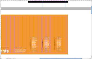
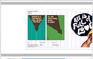
As mentioned in a previous post, i talked about how we changed the grid system from a 3 column to a 9 column grid with set margins and gutters. Below are a couple of images which show how I have been using the columns while keeping to the concept of 3.
Each text box is spread over 3 columns, which allows for 3 wide in total - again keeping to the concept of 3. The contents page below is the perfect example to show how this can be used in a clear and legible form.
An issue which has been discussed in each of our meetings in the formation and layout of imagery. It is essential that the layout works for each student, from a typographer to an illustrator.

Considerations:

  • Full bleed imagery
  • Cropped images (at the designers discretion)
  • Background colour - does it compliment or drown the design?


YB - Spreads Development